Friday, February 22, 2008
Convergence: Digital Out of Home Experience, Marketing, Pervasive Computing...
It is interesting to see how various digital technology sectors are overlapping and converging as make attempts to expand their markets, improve education.or make a social impact.
One example of this convergence is described in a recent post in Future-Making Serious Games, by Eliane Alahdeff about Reatrix, a company that focuses on interactive digital OOH marketing and "brand play". 
Excerpt from the Reatrix website:
"The unique Reactrix advertising and entertainment experience leads to unsurpassed media effectiveness, made possible by proprietary reactive technology that projects vivid branded messages onto 6-foot by 8-foot surfaces. Images instantly respond to movement or gestures, creating a participatory media experience that allows brands to "come alive" and invites people to interact with them."
I haven't come across anything from Reactrix in the course of my daily life, but when I do, I'll be sure to have my video camera ready! I wouldn't want to be disappointed.
Note:
To get a better understanding of this phenomenon, do a search on the following terms or combination of terms:
Off-the-desktop, Internet tablets, interactive whiteboards, web-enabled cell phones, sensors, GPS, GIS, "digital-out-of- home" (Digital OOH),digital signage, interactive kiosks, advergaming, wayfinding, pathfinding, "in the wild", pervasive computing, ubiquitous computing, mobile, interactive, ambient, mScapes, serious games, social spaces, public places, networked real estate, touch screens, intelligent buildings, user-centered design, user-centered content, usability, user experience design, interaction design.
Sunday, February 17, 2008
Technology-Supported Shopping and Entertainment User Experience at Ballantyne Village: "A" for concept, "D" for touch-screen usability
There is a relatively new shopping and entertainment center, Ballantyne Village, in Charlotte, N.C. that was developed in partnership with Cisco Systems Connected Real Estate and Intelligent Buildings. The goal of this project was to use innovative technologies to plan, implement, maintain, and update a customer and tenant-focused environment. This concept is sure to catch on.
Free WiFi service is available to visitors in and around the center, even at the fountain. The video security system is networked. In the movie theater's bathrooms, an e-mail is automatically sent to the manager's computer when the paper towel dispensers are low on paper. There are several interactive large touch-screen displays located around center. The displays can be easily updated to provide visitors with information about the various stores, sales, and types of activities available at Ballantyne Village.
I first learned about this center last year, when I was taking Human-Computer Interaction and Ubiquitous Computing. Since part of my work focused on large interactive touch-screen displays, I was interested to see if the screens at the Ballantyne Village center would hold up to usability standards. I had previously watched a promotional video about the center, and was hoping that the displays would prove to be "useful, usable, and used".
The promotional video will show you why I was excited about Ballantyne Village.
Purpose of my visit:
Since I was new to Ballantyne Village center, my primary goal was to quickly learn more about the shops, all located outdoors, and target my shopping around sales. Since it was a gray, cold, and rainy February day, I didn't want to spend my time exploring the center by foot. I also wanted to take a quick peek at the layout of the center to learn about other services, such as restaurants, coffee shops, and services, in order to plan ahead for future visits.
Critique
To get the full picture of my experience, first view the unedited video-clips.
Note: The narrative is what came out of my mouth as I interacted with the screens, and the perspective is first-person. This is NOT a polished voice-over.
First experience: Fade to red
Second Experience: Chasing the Red Ball
Third experience: Difficulty with navigation
The large interactive touch screen displays I found at Ballantyne Village didn't live up to potential, nor did they help me achieve my goals as a first-time visitor who happened to have some time and money for an after-work shopping session.
They displays were attractive, but they weren't very useful. They were difficult to use, and during the time I spent exploring the displays, I was the only person who interacted with the screens or noticed the other forms of digital signage in the area.
As I approached the first screen, I noticed that in order to activate the display, I had to chase a red ball around the screen. The migrating red ball attracted me to the screen, but it wasn't always functional. On the first display, as soon as I managed to touch the ball, the screen faded to red, and did not reactivate. I chased a ball on another screen, but it did not activate at all.
I was able activate another screen which allowed me to navigate and find more information. Unfortunately, the content wasn't well-organized or as interactive as I'd expected.
The display performed as if it wanted to be both a video infomercial AND an interactive website at the same time. Web-like navigation conventions, such as a back arrow and navigation bars did not always activate when touched. This might have been related to a screen calibration problem.
There were many on-screen items that were puzzling. There was a rotating map of a large view of the Ballantyne Village area that didn't seem to provide information when touched. There was another image of the main building, with small billboards displayed that looked like they were navigation tools, but did nothing when clicked. Some menu items activated when clicked, but the sub-menus that displayed did not link to anything. I never found out about the sales!
I gave up:
I wonder if the same people behind the touch-screen application at Ballantyne Village were also responsible for the user-unfriendly interactive touch-screen map I experienced at the Cleveland Clinic:
User Unfriendly Information Kiosk Map
I'm still looking for user-friendly, useful examples of large touch-screen applications in public spaces, so if you know of any, please leave a comment and a link!
In my opinion, more work needs to be done to ensure that touch-screen interaction in public spaces is truly user-friendly. For more about interaction and usability, read my post, Reflections on Interaction: Update.
Saturday, February 16, 2008
Reflecting about Interaction-Updated
I became interested in Human-Computer Interaction (HCI) initially because of my frustration with user-unfriendly desktop applications during the course of my work in the schools as a school psychologist. Over the years, I hoped that there would be some significant improvement in the types of technology and applications available to support me in my daily work.
I was too much of a dreamer to believe that years later, I'd still be interacting with "productivity" applications, unusable -or inaccessible- database systems, and "lame" educational applications for students. Although there is a need to improve the usability of traditional applications, I've come to realize that this is not for me.
Why is this so?
In addition to my training and work experience related to school psychology, social science, counseling and education, I also have a background in art, music, and dance, so I appreciate good design and the importance of multiple modes of interaction and communication. I look forward to the future.
I'm fascinated by interactive multimedia, large interactive displays, and hand-held gadgets of all kinds. I'm the proud co-owner of a Wii, and I'm not ashamed to say that I am a fan of the work of Johnny Chung Lee. I'm enthused about the work of Harry "Gravano" van der Veen and the NUI group, and also Jeff Han, from Perceptive Pixel. I'm excited about the work of people such as Bill Buxton (Multitouch Systems that I have Known and Loved; Sketching User Experiences), Dan Shafer (Designing for Interaction), Adam Greenfield (Everyware: The Dawning of the Age of Ubiquitous Computing), Rich White (EduSim) , Julian Lomberdi (Croquet), and the people behind "Putting People First", among others.
Part of the reason I maintain my blogs is to support the hard work of people who are doing great things out of the limelight - and to share the good news with people who might not otherwise have an opportunity to learn about these user-centered innovations. Sort of like cheer-leading...
When I'm out and about, I sometimes take quick pictures and video-clips of things related to interaction. Although my goal is to find examples for the "Usability Hall of Fame", most of what I've collected would be appropriate for the "Usability Hall of Shame".
Examples of user-unfriendly applications, interfaces, and devices can be found in some of my blog posts:
Usability and interaction difficulties with large touch-screen displays at an upscale shopping center...
Accessing Road Runner web-mail when you've forgotten your password...
Usability/Interaction Hall of Shame: What were they thinking?!
On the Positive
I'm always on the lookout for interesting research that is consistent with the off-the desktop theme of this blog. Here are a few things that have recently crossed my path:
Stanford University's HCI Group
How Bodies Matter: Five Themes for Interaction Design
(Scott R. Klemmer and colleagues)
"ABSTRACT: Our physical bodies play a central role in shaping human experience in the world, understanding of the world, and interactions in the world. This paper draws on theories of embodiment — from psychology, sociology, and philosophy — synthesizing five themes we believe are particularly salient for interaction design: thinking through doing, performance, visibility, risk, and thick practice. We introduce aspects of human embodied engagement in the world with the goal of inspiring new interaction design approaches and evaluations that better integrate the physical and computational worlds."
Scott Klemmer's Website
"My research goal is to create the tools and representations that will enable everyone, not just technology experts, to design interactive systems for pervasive computing..."
Here are two examples of how people use their bodies to interact with music. The quality of the first video is poor, but the interactions are fun to watch and hear:
Musical Soundscape Museum Exhibit
Multi-Touch Music Wall
(note: loud volume)
First IxDA Interaction 08 Conference
The first IxDA conference was held from February 8-10 at the Savannah College of Art and Design. I was unable to attend, but from the information presented on the conference website and the videos that were made available to the public after the conference, I know that it was a conference that should not have been missed!
Links to the conference videos, via Putting People First
Interactive Design Association (IxDA)
"Interaction Design (IxD) is the branch of user experience design that defines the structure and behavior of interactive products and services."
Thursday, February 14, 2008
Disney's House of the Future - reminds me of my childhood memories of Expo 67..
I came across an article in MIT's Technology Review on-line about Disney's revival of the "House of the Future". According to the article, the "$15 million (euro10.32 million) home is a collaboration of The Walt Disney Co., Microsoft Corp., Hewlett-Packard Co., software maker LifeWare and homebuilder Taylor Morrison."
This brought back a few memories from my childhood.
I remember visiting a "kitchen of the future" at Expo 67, in Montreal, Canada, when I was a little girl. The most amazing thing that I saw was a video phone. I was so excited to be told that in the very near future, all families will have video-phones in their kitchens!
Are we there yet?!
This clip of the Telephone Pavilion has a brief demonstration of a video phone. Even better is the demonstration of the "Telephone of the Future". Here is an excerpt:
"The Telephone of the Future - you can make a call from the palm of your hand, you touch buttons, instead of dialing, and it has an electronic tone, instead of a bell.. And one day, completely portable!"
There is a demonstration of call forwarding, a picture phone, and a means to pay bills by phone. (Listen the lyrics of the music in the background.. "this is the way we pay our bills..")
The family takes a trip to Expo '67 - (Not my family!)
(Music on the clip reportedly is from Isao Tomita's electronic music interpretation of Debussy's Pictures from an Exhibition, recorded in 1975, but somehow appropriate.)
Tour of Man in the Community pavilion - discusses man, community, and technology.
Expo 67 in Montreal
(John Whelan)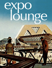
The Expo Lounge Blog
All about Expo 67!
Friday, February 8, 2008
Usability Link: Microsoft Design Center - Mobility (via Putting People First)
Take a look at the Microsoft Design Center's Mobility usability website.
I am impressed. I found the link via Putting People First.
Microsoft Design Center: Mobility
http://www.microsoft.com/design/work/Detail.aspx?key=mobility
Friday, February 1, 2008
Human-Information Interaction, Usability, User Interface Design Patterns, Mobile Web Design- Random Links
I've posted these links and will write about them when I have the chance!
Center for Human-Information Interaction
Cognitive Informatics: Enhancing Human Information Interaction and Decision Making http://www.pnl.gov/cogInformatics/hii_thrusts.stm
Human-Ubiquitous Environment Interaction Group
Ubiquitous Interaction
Ambient Findability
Physical, Social, and Experiential Knowledge in Pervasive Computing Environments
Lashups: Toolkit for Location-aware Mashups
Pervasive Visualization: Visualization on Mobile Devices
Howard Rheingold's SmartMobs companion website.
http://infosthetics.com/
http://www.w3.org/Mobile/
Adaptive Path Blog: Dan Harrelson's article 2008: The Year of Great Mobile Interfaces
Google's Android: Open Handset Alliance Project
Yahoo!'s Go
W3C Mobile Web Initiative
W3C Ubiquitous Web Applications Workgroup
Book: Barbara Ballard's UI Design Guidelines for Mobile Web Development
http://www.smashingmagazine.com/2008/01/31/10-principles-of-effective-web-design/
Anders Toxboe's UI Patterns
Yahoo!'s Design Pattern Library

